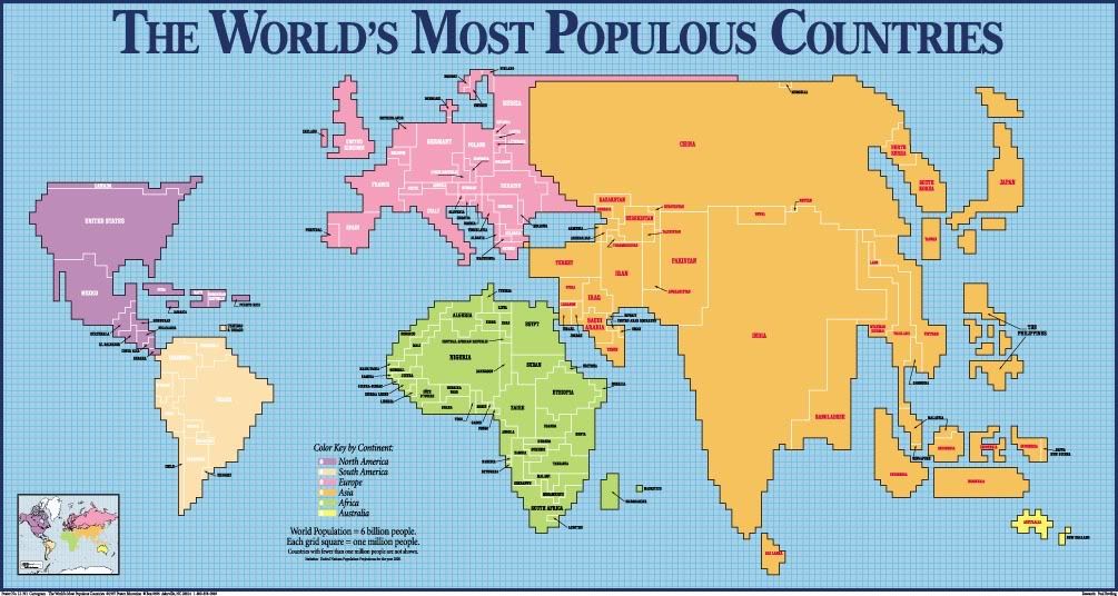
http://www.dailykos.com/story/2012/07/10/1106266/-Electoral-College-Map-Porn-Cartogram-Peep-Show#Cartograms are maps that show differences in the mapping variable by distorting the size of the land mass. For the map above, the larger the land mass, the larger the population. Along with population, these maps can show GNP, GDP, and even things like greenhouse gas emissions. These maps are great because they show the information in an easy way to decipher and compare to each other.
No comments:
Post a Comment