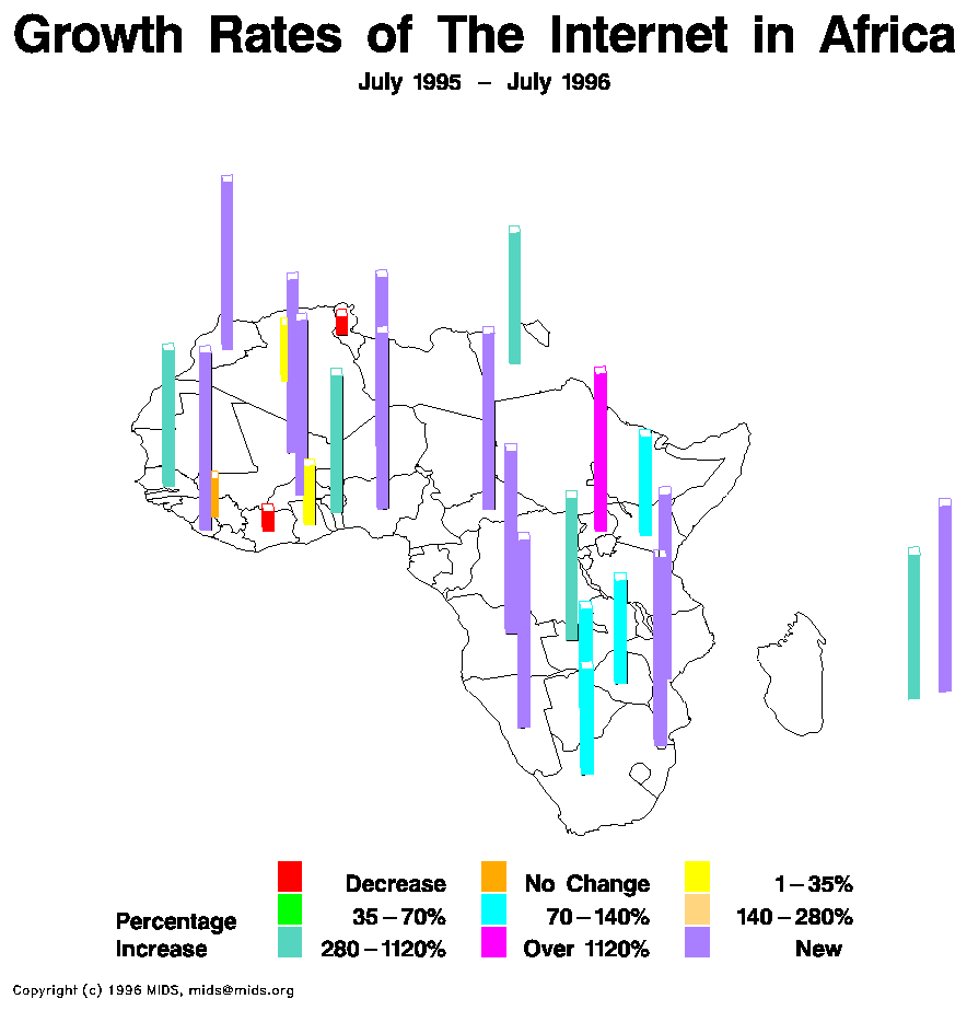
Statistical maps take numerical data and and display it in a map form. In these maps an actual number amount is assigned to the information instead of comparing sizes. These maps are great to use and show in depth information, but are generally not as easy to compare data like cartograms. With these maps you have to actually study the map to get the information you want. The map above shows the increase in internet usage in Africa. The map uses color to differentiate percentage increase and provides a key at the bottom.
No comments:
Post a Comment