Tuesday, April 15, 2014

Similarity Matrix

http://tomcat.esat.kuleuven.be/txtgate/tutorial.jsp
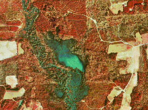
A similarity matrix is a graphic with a matrix of scores used to show the similarities between data points. These maps are used to find clusters of data points and in aligning sequences of DNA.  The map above is a similarity matrix that is aligning a sequence of DNA.

Black and white arial photo

http://www.math.toronto.edu/drorbn/Gallery/KnottedObjects/Interchange/index.html
A black and white Arial photo is exactly what the name says it is, an Arial picture in black and white.  These pictures are usually taken from a plane or a satellite and are used to view the roads, vegetation, and other topographical features in a different fashion. This map above is a black and white arial photo of an interstate in Baltimore.

Continuously Variable proportional circle map

http://personal.frostburg.edu/jaelder0/maps.htm
A continuously variable proportional circle map is a map that uses circles to show various quantities of some phenomenon.  What makes it continuously variable is that there is no set range of sizes for the circle.  In these maps each numerical value has a corresponding circle size.  The map above shows the aggravated assault arrests by state through the use of circle size to show quantity.  Its easy to see that California has the highest number of arrests.

Star Plot


A star plot also know as a spider chart is a graphic used to show a bunch of information about sets of data.  These plots are used to show comparisons of two or more variables and the simultaneous outcomes.  The plot above is a star chart that compares the allocated budget of a company with the actual sales.  From the map one can see where the company allocated too much money and where the company didn't allocate enough money.

Stem and leaf plot

http://www.mytestbook.com/test_questions.aspx?test_id=235&topics=Stem%20Leaf%20Chart&subject=Math&grade=5
A stem and leaf plot is similar to a histogram in that it shows the distribution of a qualitative data set in a graphical format. This map type shows data broken down over intervals. the map above shows quiz scores for a class broken down in ten percent intervals.  The stem number is just an interval which the leaf is attached to.  For example the stem of '4' and its corresponding leaves show the numbers 40 and 49.

Box Plot

http://www.statmethods.net/graphs/boxplot.html
A Box plot is a graphic that shows data groups through quartiles that show percentile. Each box has lines called whiskers that extend out from the box to show the minimum and maximum observation. Sometimes outliers of the data will shown by plotting dots outside of the whiskers.  This map is showing Box plots of the various car cylinder makes and their correlated miles per gallon. Its clear to see that the more the cylinders, the lower the miles per gallon.

Histogram

http://libweb.surrey.ac.uk/library/skills/Number%20Skills%20Leicester/page_50.htm
A histogram is a graphic that shows the statistical distribution of a set of data.  These maps are usually used to show a frequency of some variable across intervals. The map above shows the frequency of participating in sports or exercise across the different age intervals.  This histogram clearly shows that as age increases, participating in sports or exercise decreases.

Windrose

http://www.originlab.com/www/products/GraphGallery.aspx?s=1&&k=Bar,Grouped%20Plot,Stack

A Windrose is a graphic used to show the distribution of wind speed and wind direction of a certain location.  The direction of the wind is shown by cardinal orientation and the speed is shown by the length of the band or by the use of color. These maps are mostly used by meteorologists, but could also come in handy to air traffic control men and pilots. The map above is a Windrose for an unknown location and shows that winds are blowing strongest from the Northeast.

Climograph

http://www.colorado.edu/geography/extra/geogweb/manitousprings/intro/page2.html
A climograph is a map that shows the monthly average temperature and precipitation of a certain location. These maps use a bar graph to show the average precipitation and a line to show the average temperature. This map type is great at showing the typical climate of a place in an easily understood format. The map above shows the average climate for Manitou Springs, Colorado.  From the map its easy to see that the months of June and July had significantly more precipitation than the others.

Population Profile


A population profile is a graphic that shows a break down of a population into age and gender.  Some of these maps can also use color to show another characteristic of that population.  The population profile above shows the breakdown of the population of Botswana into gender and age groups along with adding in another variable differentiated by color.  The map uses color to show the number of people with AIDS and the number of those without AIDS.

Monday, April 14, 2014

Scatterplot

http://www.statmethods.net/graphs/scatterplot.html
A scatter plot graph is a mathematical diagram used to show caparison of data between two variables.  The different values are depicted by dots and are analyzed to see if a relationship exist between the variables. Sometimes a trend line (best fit line) is drawn through the dots to show the average slope of the points. This plot shows the relationship Between car weight and miles per gallon. From the map it is easy to see that as car weight increases, generally the miles per gallon will decrease consequently.

Index Value plot

http://www.muhlenkamp.com/investment/principles/whats_the_new_normal_economics_rules_markets
Index value plots are representations that show index values, rather than absolute values, on a line graph.  These types usually provide a normal or value of comparison from which the observations are made.  The map above uses '50' as its normal value to show that index values above 50 are expanding and those below are contracting.  This map shows the patterns of non-manufacturing businesses' growth over the years, emphasizing the recessions.

Lorenz Curve

http://www.sarpn.org/documents/d0000990/ A Lorenz curve is graphical representation of the probability distribution of a measurable data and is used to show the inequality that exists between variables.  This Lorenz curve is meant to show the cumulative percent of income the exists in the cumulative percent of households. The space between the the Lorenz curve and the line of perfect equality represent the area of inequality.

Bilateral Graph

http://www1.eere.energy.gov/vehiclesandfuels/images/facts/fotw546.jpg
A bilateral graph is a graph that specializes in showing both negative and positive values of measure. These graphs are usually in bar or line form, but can vary.  This graph shows the percent growth of automotive sales from the various places.  The map shows negative growth for all except for china, which showed tremendous percentage growth in three of the four quarters.

Nominal area choropleth map

http://www.veiled-chameleon.com/weblog/archives/2004_07.html A nominal area choropleth map is a thematic map that uses colors or patterns to distinguish between the measured data.  What separates these from the rest is the fact that these maps use nominal data or data that is qualitative, not quantitative.  These maps usually do not contain numbers and are used to show differences across states or countries.  This map shows the differences in political party choice among the U.S. states

Unstandardized Choropleth Map

http://naturalspecialtyfoodsmemo.blogspot.com/2008/05/ethnic-retailing-memo-wal-mart-to-open.html
Unstandardized Choropleth maps are thematic maps that shows the raw data or numbers instead of averaging or standardizing it. The map above shows the totals for the estimated U.S. born Hispanic population. This information is not standardized because it is not conformed by another variable like per square mile.

Standardized Choropleth Map


http://www.directionsmag.com/articles/choropleth-mapping-with-exploratory-data-analysis/123579
Standardized choropleth maps are simply maps that show information that has been standardized or conformed to a certain standard. An example of standardized information is population per square mile where the total population is conformed to a per mile standard.  The map above shows the population density of an area on a square kilometer basis.  The 'per square kilometer' add-in is what makes this map a standardized choropleth map.

Univariate Chorpleth map

http://www.agcensus.usda.gov/Publications/2002/Ag_Atlas_Maps/Crops_and_Plants/index.asp
Univariate Chorpleth maps are maps that unlike Bivariate maps, strictly display one measurable variable. These maps are simpler and used when showing one phenomenon.  The map above shows the acres of harvested corn for grain across the U.S. The different shades show the different amounts of acres harvested.

Bivariate Choropleth Maps

http://upload.wikimedia.org/wikipedia/commons/f/fc/2004US_election_map.com
Bivariate Choropleth maps are maps that display two different measurements on the same map by using two different graphics or symbols.  These maps are great to show the presence of two related phenomena. The map above shows the voting percentages for the 2004 election along with the percentage turnout of the voting population by state.  From this map one can see which candidate was favored and, at the same time, what percentage of the voting population actually voted.

Unclassed Choropleth Maps

http://www.princeton.edu/~rvdb/JAVA/election2004/purple_america_2004_small.com

 Unclassed Chorpleth maps are maps that use proportional shading to show the difference in a measurable variable. These maps are unclassified because they do not declare set of 5-10 or so ranges of shades and matching numerical values.  Instead, they have a full spectrum of shaded colors each with a corresponding numerical value. The map above shows the difference in political party choice across the US.  The freedom of shades allows for overlapping of colors to show a more accurate depiction, which in some places creates a purple shade.  In this map the more red a shade is, the more republican it is.  Likewise the more blue a shade is, the more democrat it is.

Classed Choropleth maps

https://www.e-education.psu.edu/natureofgeoinfo/book/export/html/1553
Classes choropleth maps use shading or patterns of areas to show a measurable variable. The map is shaded or patterned in proportion to what ever is being measured. What sets these maps apart from the others is that the shading is done in set classes or ranges put fourth through the map legend.  This is a map that shows the Hispanic population density across the US.   What makes it a classed choropleth map is the legend at the bottom that declares the shade color and corresponding numerical  value.  On this map, the darker the shade, the higher the Hispanic population density.

Thursday, April 10, 2014

Range Graded Proportional Circle Map

http://personal.frostburg.edu/atgates0/maps.htm
Range graded proportional circle maps are maps that use size of circle to indicate quantity.  What separates these maps from other proportional circle maps is that these show a range of circle sizes vs having a number of varying sizes correlating directly to quantity.  These maps are great at showing the levels of comparison and allow the viewer ease in interpretation.  The above map shows the number of airports per country in Europe from 2007.  The map key shows that there are 5 ranges of circle sizes correlating to quantity of airports.

DOQQ

http://www.lib.ncsu.edu/gis/doqq.html
DOQQ or Digital Orthophoto Quarter-Quadrangle map are maps made by either aerial photography or satellite imagery which cover a small area of 3.75 minutes longitude and 3.75 minutes latitude. These maps are alined so that the pixels are correct with lines of longitude and latitude. This map is an infrared DOQQ of Johnston county that shows the topography of the region. Its clear that the image was taken from either a plane of a satellite.


DEM map

http://www.satimagingcorp.com/gallery/dem-sahara-tunisia-lg.html
DEM or Digital Elevation Model is a map that shows a three-dimensional representation of a planet, moon, or asteroids surface. These maps use remote sensing technology to not only map a region, but to map the region into a digital model. Map makers use these models to show or create relief in a map.  The map above is a DEM of the Sahara desert in Southern Tunisia.  The map shows a true image of the desert along with true elevation of the area.

DLG map

http://www.mapcruzin.com/free-geodata-shapefiles/usgs-geospatial-data-geodata-geographic-download.htm
DLG or Digital Line Graph is a USGS map feature that allows maps to be represented in a digitized form.  DLG maps are created from USGS standard maps are can be in small, intermediate, or large scale. These maps are used mainly for a number GIS applications. The map above is a DLG of maps of Illinois and Missouri.

DRG map

http://topomaps.usgs.gov/drg/drg_technical.html
DRG or Digital Raster Graphics maps are simply scanned versions of USGS standard series topographical maps. The purpose of these is for completely accurate computer versions of the USGS paper maps. The map above is a DGR of an unknown region containing Lookover lake and topography of the surrounding region.  This map is a computer graphic of a real map created by the USGS.

Isopleths Map

http://www.flutrackers.com/forum/showthread.php?t=132504
An isopleths map is a map that uses lines to connect points of equal value of some measurement.  These maps are used to show the variation of a measurement in comparison with other parts of the region.  This map uses isopleths to show the variation in deaths across the state of California in 2009.  Though this map uses color along with the lines to show the variation, this may type could use only lines with numbers to display the data.

Isopach Maps

http://www.volcano.si.edu/volcano.cfm?vn=341120&bgvn=1&rnum=region14&snum=mexico&wvol=chichon
An isopach map uses contour lines called isopachs to connect points of equal thickness of stratum. These lines are used to show variations in the thickness of sedimentary layers of the earth. The map above shows the variations in thickness of compacted ash surrounding a volcano named El Chichón in Mexico.  Sometimes these maps can include color to better differentiate the changes in thickness.

Isohyets map

http://www.hko.gov.hk/wxinfo/pastwx/mws201206.htm
Isohyet maps is a form of isoline maps that use lines called isohyets to connect geographical points of equal rainfall. In these maps sometimes shading is used to make it easier to interpret to the untrained viewer. This map uses isohyets to show the June 2012 rainfall amount in Honk Kong measured in millimeters.  The rainfall is heaviest in the redish shaded areas and lighter in the blueish shaded areas.

Isotachs Map

http://www.intellicast.com/National/Wind/WINDcast.aspx?location=USFL0479
An isotachs map is a form of isoline map that uses lines to connect points of equal wind speed.  These lines are called isotachs. Once again these maps are of great use to meteorologists, but could also be used by pilots and fishermen. The map above shows the wind speeds forecasts over Florida by using isotachs to connect points of equal wind speed.

Isobar Maps

http://facweb.bhc.edu/academics/science/harwoodr/GEOL101/Labs/Wind/index.htm
An isobar map is a form of isoline maps that focuses on pressure.  This map form uses continuous lines to connect points of equal pressure.  These lines that connect the points are called isobars and thus the reason why the map is named what it is.  This map type is especially used by meteorologist to predict future weather patterns, but could also be used by various technology related fields.  The map above is in fact an isobar map because it uses isobars to show the various barometric pressures across the U.S.

Wednesday, April 9, 2014

LIDAR map


LIDAR is an abbreviation for 'light detection and ranging.' This is a remote sensing technology like radar that uses light from a laser instead of micro waves to measure distance and other properties.  The uses of this technology go into almost every field like agriculture, military, law enforcement, physics, and the list goes on.  These maps are great at mapping a surface with very high resolution as to include every change in elevation.  The map above was made using LIDAR to show a 3-d model of Manhattan, New York.

Doppler Radar

http://www.noaanews.noaa.gov/stories2004/s2311.htm
A Doppler radar map is a map that uses microwaves to determine distance and velocity of objects, usually storms.  This radar works by sending out microwaves towards a target and analyzing the frequency in which the microwaves return. The information can then be computed into a map of the target. These maps are very useful for tracking storms and revolutionized meteorology. The map above qualifies because it is a map created by using doppler radar to track the storms movement. These maps are usually animated to show the speed and direction of the storm.

Infrared Arial Photo

http://www.achromaticplus.co.uk/index.php?page=infrared-aerial
An infrared Arial photo is a picture taken from high above the earth's surface using infrared technology.  This technology is used to capture wavelengths of light that are outside of our visual spectrum.  These photos are used widely in agriculture to easily distinguish between types of vegetation and to note crop growth.  The basic use of these maps is to notice things that would not be noticed with the human eye.  The map above is an infrared photo that easily shows the changes in vegetation along the coast.

Cartographic animation

http://www.mthurricane.com/Hurricane_Charley.htm
Cartographic animations are simply maps that are animated using computers to show a change in another dimension, usually time.  The map above is only a screenshot of the animated radar from hurricane Charley. The real map shows the storm moving and rotating to the north.  These maps are great to show a change or progress over time and are a meteorologist best friend.

Statistical maps

http://personalpages.manchester.ac.uk/staff/m.dodge/cybergeography/atlas/census.html
Statistical maps take numerical data and and display it in a map form.  In these maps an actual number amount is assigned to the information instead of comparing sizes.  These maps are great to use and show in depth information, but are generally not as easy to compare data like cartograms.  With these maps you have to actually study the map to get the information you want.  The map above shows the increase in internet usage in Africa.  The map uses color to differentiate percentage increase and provides a key at the bottom. 

Cartograms

http://www.dailykos.com/story/2012/07/10/1106266/-Electoral-College-Map-Porn-Cartogram-Peep-Show#Cartograms are maps that show differences in the mapping variable by distorting the size of the land mass.  For the map above, the larger the land mass, the larger the population.  Along with population, these maps can show GNP, GDP, and even things like greenhouse gas emissions. These maps are great because they show the information in an easy way to decipher and compare to each other.

Flow map

http://www.gislounge.com/overview-flow-mapping/
A flow map is defined as a mix between a map and a flow chart.  These maps show movement of objects or people from place to place.  This map above shows the flow of goods to and from the U.S. It uses a line to show the direction or destination of the goods and the width of the line to show the quantity.  These maps have a number of purposes from showing the traffic on roads to showing the immigration of people. An interesting map I noticed in my searching showed the flow of diseases from Europe, which would be very useful to a number of people.

Isoline Maps


An isoline map is a map that uses continuous lines to connect points of equal value.  These maps are great at measuring altitude, temperature(like the one above), wind direction, pressure, wind speed, and more.  Here the map uses isolines to show the different temperatures across the U.S. and groups the areas of similar temperature.  Sometimes these maps can show two or three different measurements like sea level pressure with temperature at the same time.

Proportional circle map


http://personal.frostburg.edu/crkitzmiller0/maps.htm

This is a proportional circle map that shows the number of births in the U.S. by state.  In these maps they use size of the circle to indicate quantity.  A bigger circle means there is more of whatever is being measured and a smaller circle means there is less. In this map its easy to see that the most births occurred in California. These maps are great at showing comparisons because the information is easy to interpret.

Tuesday, April 8, 2014

Choropleth Map

http://hosting.soonet.ca/eliris/remotesensing/bl130lec7.html
A Choropleth map is a form of thematic map that uses shading or pattering to portray an feature of an area.  These maps provide an easy way to view a form of data about a place.  This map very clearly shows the differences in life expectancy across Africa.

Dot Distribution Map

http://www.maps.com/ref_map.aspx?pid=12867
A dot distribution map is a map that uses dots to show the existence of some sort of phenomenon.  While most of these maps are used show population density, they can also show racial density, crime rates, and other features of an area. The map above is a population density dot distribution map of the world. It shows the population density of the world by using red dots to represent every 100,000 people.

Propaganda Map

http://www.frikipix.com/web/the-world-according-to-ronald-regan/
A propaganda map is a map that has a goal of achieving the same effect as traditional propaganda.  These maps are not used for navigation and are usually distorted in a way to portray an idea.  The map above is distorted to show how Reagan saw the world during the cold war. It portrays a number of different ways in which Reagan sees the US and countries of the world.

Hypsometric Maps

https://www.e-education.psu.edu/geog030/node/369

A Hypsometric Map is a map that uses shading or tinting to show differences in elevation of a place on Earth. This map above shows the different elevations across the US by using a color scale.  Other map types like topographic could show the same information, but by using contour lines.  The use of shading or tinting is what separates these maps from the others.

PLLS map

http://www.fairview-industries.com/standardmodule/mn-exmpl.htm
A PLSS map is a government-made map that is created using the Public Land Survey System(PLSS). The PLSS is a surveying method used in the United States to survey and identify land parcels.  The PLSS typically divides land into 6-square-mile townships and then divides those into 36 one-square-mile sections. If needed these sections can be divided further into quarters and so on. This map above is a PLSS map that shows the townships of a particular area in the U.S.  This system is used manly for dividing land to make it easier to sell and regulate.

Cadastral Maps

http://www.cadastraltemplate.org/fielddata/d2.htm
A Cadastral map is simply a map that conveys information about actual properties in an area. This map above shows the many properties that exist in a subdivision. These maps can sometimes go further and portray information like tax rates, land structures, owners, and zoning regulations.  Cadastral maps are usually maintained by the government, but are free to use by the public.  This map type is very useful for a number of fields such as land surveyors, real estate agents, and regular civilians. They could use these maps to settle disputes over land boundaries, ownership, and zoning issues.

Thematic Map

http://www.catsg.org/cheetah/07_map-centre/7_1_entire-range/thematic-maps/thematic-maps.htm
A Thematic map is just a map that focuses on a particular theme or subject.  Unlike other maps, this map type uses geographic locations only as points of reference. This map is not used to navigate your way around Africa, it is used to show the cattle population around the continent. Thematic maps can show population density, climate, and other cultural or physical phenomena. Other maps tell about where a place is or how to navigate that place, but thematic maps simply convey facts about that place.

Topographic map

http://mail.colonial.net/~hkaiter/topographic_maps.html
Topographic maps are used to show detailed and accurate graphic representations of features that appear on the Earth's surface.  These maps show things from roads, buildings, and other urban, man-made developments to lakes, rivers, mountains, valleys, and other vegetated areas. Basically this type of map will provide a three-dimensional representation of earth's surface.  This map is a Topographic map because it shows a representation of the surface(a mountain) in three dimensions through the use of contour lines.

Planimetric map

http://www.eserc.stonybrook.edu/Sayville/
Planimetric maps only show the horizontal orientation of features on Earth's surface.  This type of map reveals natural and cultural physical features, geographic objects, and entities without topographic properties. These maps show features such as: driveways, curbs and gutters, culverts, fences, trails and vegetation.

Mental Map

http://mentalcharlois.wordpress.com/tag/mental-mapping/


This is a mental map because it shows this map maker's personal representation of this town or city.  The map shows what this particular person knows about the locations of the various places mapped and is not completely geographically accurate.  The scales and distances are all based on the map makers personal visualization of the area and previous knowledge acquired.  Though mental maps are sometimes difficult to make, they are easy to use and a great way to work on developing a better spacial representation of the world.